CCC Architecture
Programs in Architectural Studies at the City Colleges of Chicago
Plan Graphics for Presentation Drawings
Designers prepare different types of drawings for different purposes. Some drawings are construction drawings, and they are prepared for contractors who are responsible for the assembly of the project. Another type of drawing is a presentation drawing. The purpose is to describe the design. Generally, presentation drawings are shown to clients during the design process. While in school, these drawings are presented to instructors and classmates.
A construction drawing will include the information necessary to assemble the project. More detail is needed for this type of drawing. For example, they typically include dimensions. A contractor needs to know the sizes and placement of materials, walls, etc. These drawings also have more detail.
On the other hand, a presentation drawing has information that describes the general arrangement and design intent.
Lineweight
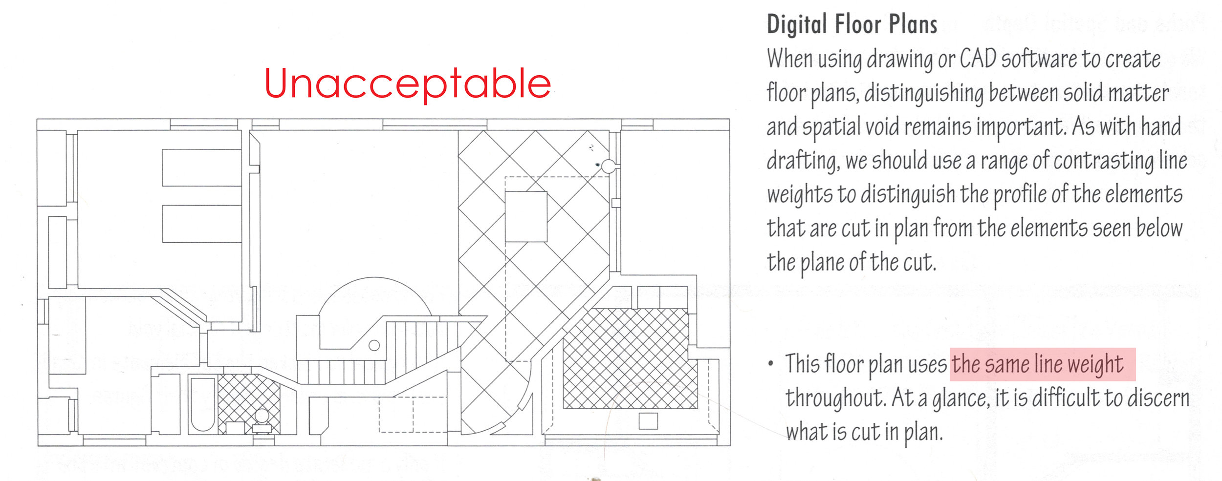
Lineweight is a critical consideration in the graphics for all drawings. The basic principle is that the heavier (thicker) a line is, the more important it is. The graphics for the plan below are unacceptable because everything is represented with lines of the same thickness.
From Ching, F.K., Architectural Graphics, 5th ed, p. 50.
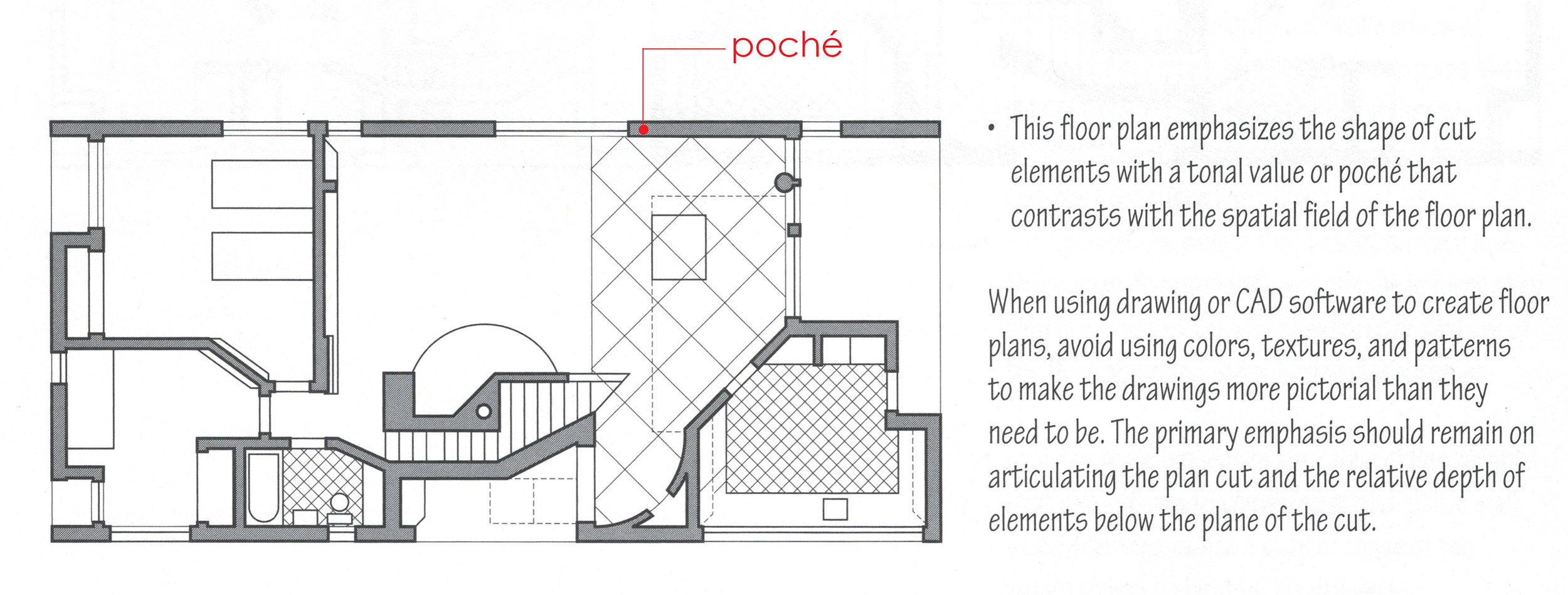
For architectural drawings the most important, and therefore heaviest line is the line of a surface profile. What is a surface profile line? in a plan drawing the surfaces of walls are represented by a
From Ching, F.K., Architectural Graphics, 5th ed, p. 50.
Poché (pronounciation: poh-shey)
Cut elements are sometimes filled with tone or a hatch pattern. This is referred to as poché. It is a French term. Originally, it was used to represent elements made of solid materials, such as a stone column. Now it is used to articulate areas that can not be entered or experienced spatially. For example, it could be a wall that has hollow spaces between wood studs. Using poché helps to define the habitable versus non-habitable spaces. If you choose to poché your walls in plans, you would use the same fill to identify cut walls, floors, and roofs in your section drawings. The fill can be black, a gray tone or a color.
From Ching, F.K., Architectural Graphics, 5th ed, p. 50.
What to show or not to show on a presentation plan?
Yes: doors, windows, walls, furniture, titles, section markers, graphic or text-based scale, north arrow
No: dimensions, construction notes, door and window tags, datums, column bubbles
Dashed LInes
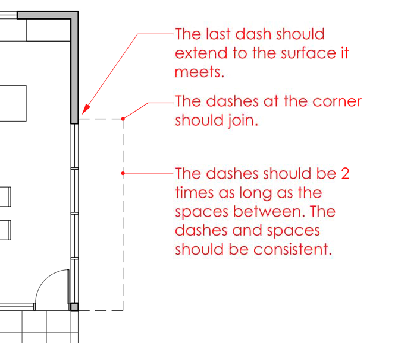
Dashed lines on a floor plan indicate the edges of surfaces above. In the image below the dashed lines may represent a balcony, the extension of and upper floor or a roof plane.
Doors
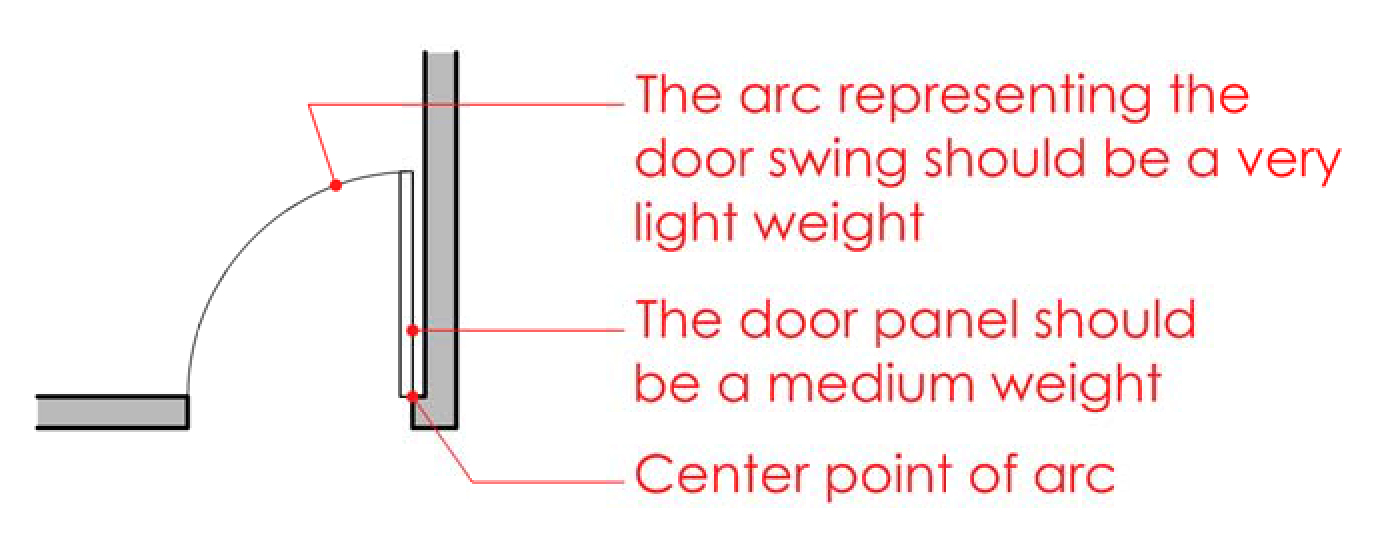
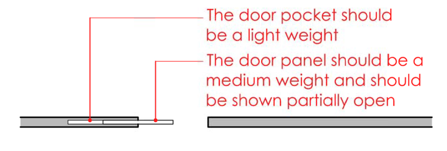
Swinging doors should be illustrated as shown below. Door panels are typically 1-3/8” to 1-3/4” thick. Normally, a door swings into a room, and it swings against a wall if it is located in a corner of the room. There is usually a space between the door and the wall. The minimum dimension for that space is 2”, although it is common to be closer to 4” permitting the installation of a casing or frame. If you are using poché in your walls, you should also fill the door panel with poché.
Use the graphic shown below for pocket doors. The width of the opening, the width of the door panel and the depth of the pocket should all be the same.
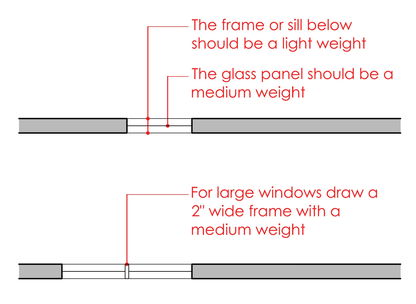
Windows
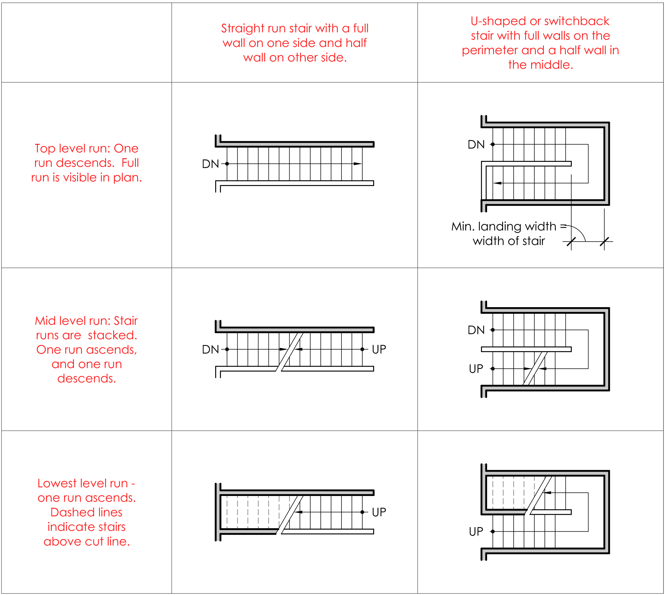
Stairs
The graphics for stairs depend on the level. Below is an example of a straight run stair and a u-shaped (switchback) stair.
Furniture
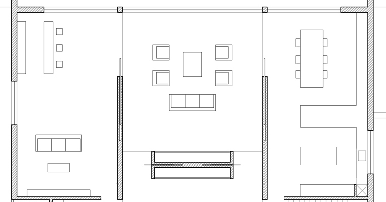
For some projects showing furniture eliminates the need to include room names. Furniture also gives a sense of scale. We understand how big a room is without dimensions when the furniture is drawn to the correct scale. Be careful with blocks and building components that you download. Some of them have too much detail and will appear too heavy on the drawing.
Partial House Plan by Alberto Campo Beaza
Annotations
Annotations include notes, reference tags, dimensions, column bubbles, and titles. For presentation plan drawings the necessary annotations are minimal. They include section tags, drawing titles, north arrows and scale notations.
The sizes noted below are recommendations for 1/8” scale plans. If you are printing to a different scale, it is recommended that you adjust the sizes of the graphics. To test the graphics you will need to print the drawings before the final printing.
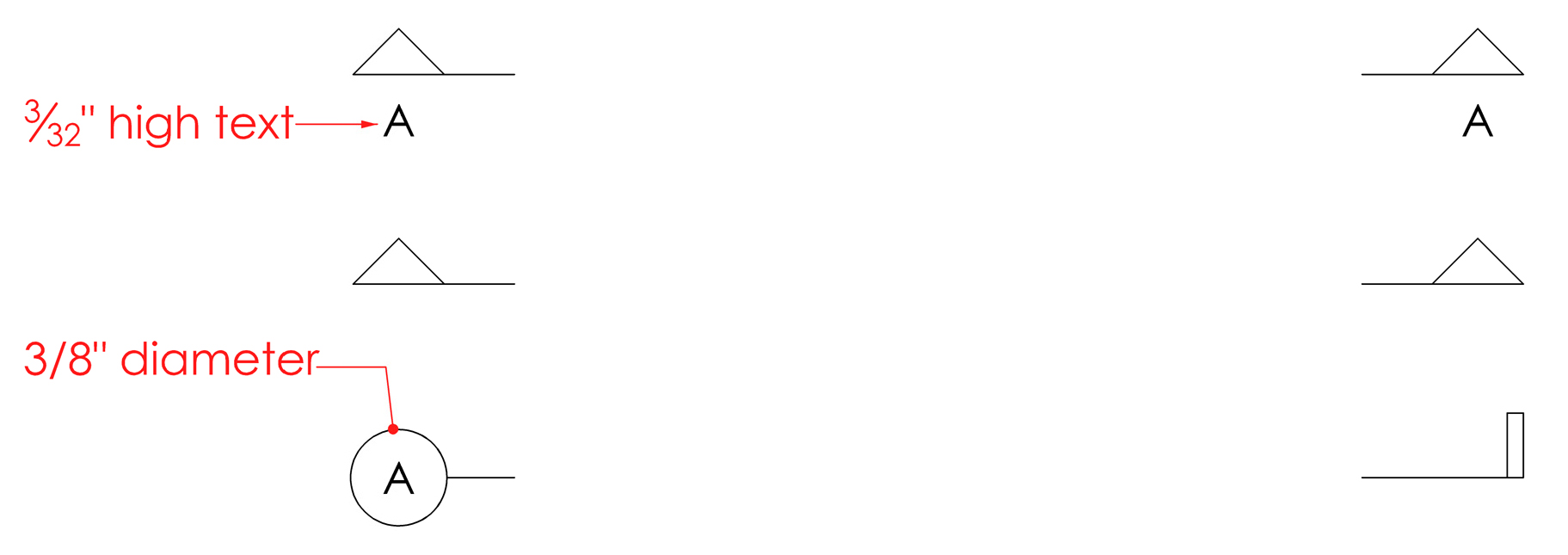
The graphics below are options for section tags. The arrow and tail directions indicate which way the section is looking. A letter designation can be used to reference the section if there are more than one. The graphics for these annotations should be light. One tag will appear on each side of the plan. Notice how the there is no line connecting the two.
A north arrow is used only on plans. Typically, north is oriented up. The double line indicates the direction of north. If your plan is rotated to some other orientation, the north arrow must be rotated too. Two options are shown below.
The title of the drawing appears at the bottom of the plan. Typically, it is left justified. Occasionally, it is centered. The scale is noted as well, either as text or as a graphic scale.
.
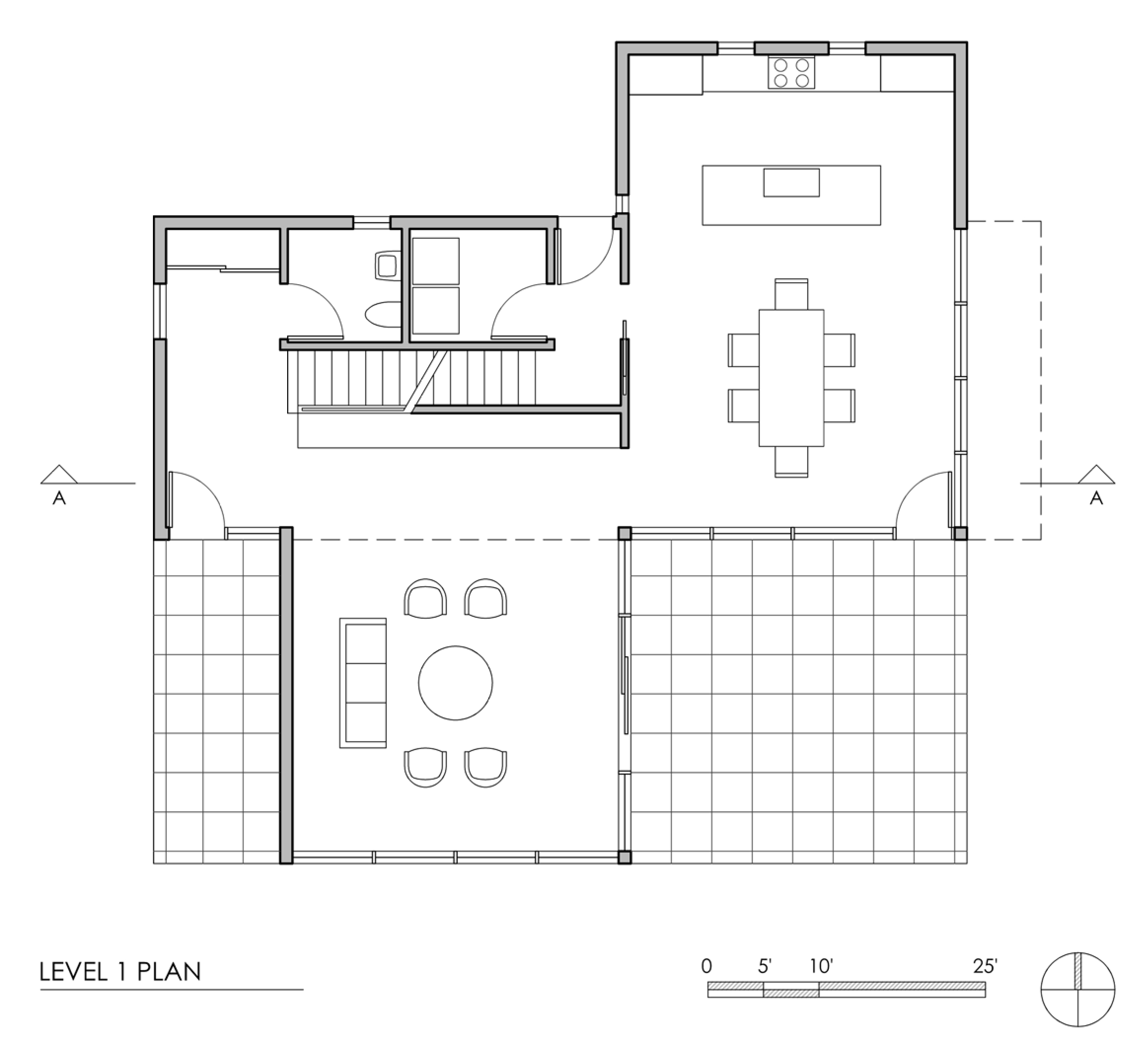
The plan below integrates the graphic recommendations noted above. A grid plan is used to represent exterior spaces.
.
